Identity master versus application
Reusable logo assets carry the intended geometry. Packaging and photographic applications are visual concepts; a generated appearance is not a substitute for the identity master.
 ETHAN+LABFollow along
 Brand / Implemented
From category research to a wordmark, a visual system, and a recognizable store.
RECORD THROUGH SEPTEMBER 7, 2026
The starting references, Arte Collective and IKONICK, established a standard for art presentation. Their product imagery, collection structure, and shopping hierarchy were studied as design decisions. Their licensing relationships, testimonials, and commercial performance were not evidence for INKRALLY.
The reusable part was a typographic system. An early generic symbol was rejected; the final wordmark became the consistent signature across the catalog and storefront.
Research separated the artwork, its room context, the collection taxonomy, and the purchase interface. That made it possible to borrow useful presentation principles while developing an independent identity.
The work moved toward a wordmark-only identity after Ethan rejected a generic icon. Typography, a controlled palette, and consistent logo variants became reusable inputs for the website and creative.
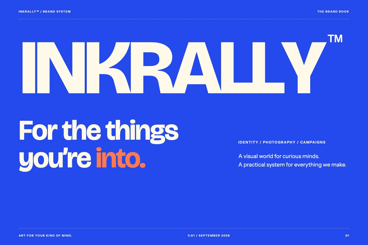
A guide brought the wordmark, colors, typography, and physical application concepts together. A logo that looks convincing by itself still has to remain legible next to detailed artwork and at small interface sizes.
Reusable logo assets carry the intended geometry. Packaging and photographic applications are visual concepts; a generated appearance is not a substitute for the identity master.
The storefront and creative use the same typographic direction and restrained palette. Consistency comes from reusing those decisions, rather than asking for a new interpretation on each page.
An early generic symbol added a second visual idea without making the brand more distinctive.
The wordmark and its variants became the main brand signature.
The decision: Ethan selected a stronger text-led identity and rejected the symbol.
Ethan chose the initial references, rejected the generic mark, and set the standard for the identity.
GPT-6 carried out research, developed the identity, wrote the storefront styling, and assembled brand assets with design and image tools.
Selected pages from the completed brand guide show the wordmark and palette.
The live storefront uses the INKRALLY identity across navigation, product presentation, and collections.
Packaging applications are concepts. They do not confirm the packaging a fulfillment partner will ship.
Based on retained project records and selected public artifacts. Historical checks describe the recorded release; they are not continuous monitoring or an independent audit.
Selected public artifacts are linked here. Raw review notes, production settings, account data, and private working files are excluded.